Two-Tone Kitchen Cabinets: 2026 Ideas, Combos, and Costs
The color combinations that work, exactly where to place each shade, and what two-tone cabinets cost in the US in 2026.

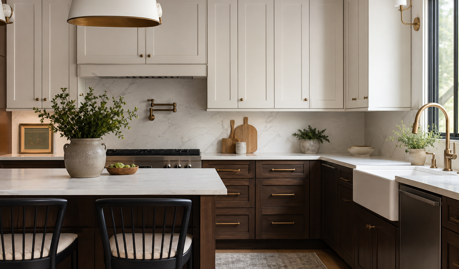
Two-tone kitchen cabinets are the easiest way to give a kitchen depth, personality, and a custom look without redesigning the whole room. Instead of committing every cabinet to one color, you split the palette, usually a darker shade below and a lighter one above, and the contrast does the heavy lifting. If you are weighing two-tone kitchen cabinets for a 2026 remodel or refresh, this guide covers the color combinations that actually work, exactly where to place each shade, how to keep undertones from clashing, and what the job costs in the US right now.
It is a look that reads as intentional and high-end when done well, and busy or disjointed when done carelessly. The difference is almost always in the details below.
What Are Two-Tone Kitchen Cabinets?
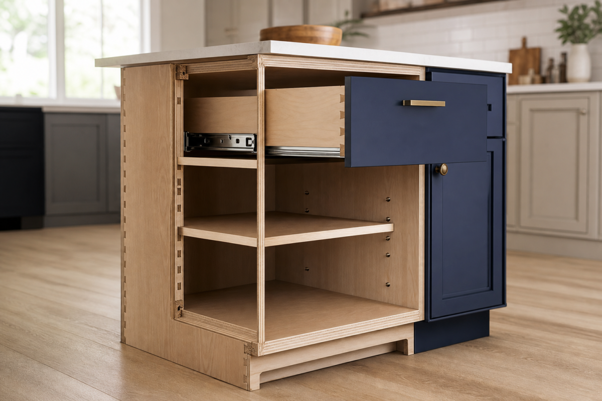
Two-tone cabinetry simply means using two different colors or finishes in the same kitchen. The most common approach pairs one color on the upper cabinets with a second on the lowers, but the split can also run between the island and the perimeter, or between a tall pantry wall and the rest of the room. The two finishes can be two paint colors, or a painted color paired with natural wood, which is one of the most timeless combinations there is.
The strategy borrows a basic design principle: lighter colors recede and feel airy, darker colors advance and feel grounded. Placing them deliberately lets you shape how tall, wide, or cozy a kitchen feels.
Why Go Two-Tone in 2026?
Two-tone cabinets remain firmly on trend because they solve real problems. They let you use a bold, of-the-moment color without overwhelming the room. They visually raise a low ceiling or ground a cavernous one. And they let you introduce warmth or drama while keeping resale-friendly neutrals in play. In 2026, the palette has shifted toward earthy, nature-inspired tones, mushroom grays, muted greens, warm taupes, and creamy whites, alongside the enduring navy-and-white and wood-and-white pairings.
There is also a practical angle. Darker lower cabinets hide scuffs and fingerprints near the floor and toe kicks, where wear shows most, while lighter uppers keep the room feeling open. Two-tone is also forgiving for phased remodels: you can repaint or replace the lowers now and the uppers later without the mismatch that plagues single-color kitchens. For a full picture of how cabinetry fits your overall budget, see our kitchen cabinet cost guide.
The Best Two-Tone Color Combinations
The strongest combinations pair one neutral or wood tone with one color that carries the personality. Below are the pairings designers reach for most, and who each one suits.
White and natural wood
Crisp white uppers over white oak or walnut lowers is the most timeless two-tone look and the hardest to get wrong. The wood adds warmth and texture while the white keeps everything bright. It bridges modern and traditional, which is why it dominates 2026 kitchens.
Navy and white
Deep navy lowers with white uppers is the classic bold-but-safe choice. Navy behaves almost like a neutral, pairs with brass or polished nickel beautifully, and gives a white kitchen a clear anchor. It is the combination most likely to still look right in ten years.
Green and white or wood
Forest, olive, and sage greens paired with white or natural wood are among the fastest-growing choices. A green island against white perimeter cabinets reads fresh and organic without shouting. Sage in particular flatters warm-white walls and brass hardware.
Charcoal, black, and greige neutrals
For a quieter contrast, pair soft white uppers with charcoal or greige lowers. Black lowers with white uppers deliver high drama and hide dirt well. Mushroom gray and warm taupe are the 2026 neutrals that feel current without the starkness of true gray.
| Combination | Mood | Best placement |
|---|---|---|
| White + natural wood | Warm, timeless | White uppers, wood lowers or island |
| Navy + white | Classic, bold-safe | Navy lowers, white uppers |
| Sage or forest green + white | Fresh, organic | Green island or lowers |
| Charcoal + soft white | Modern, grounded | Charcoal lowers, white uppers |
| Black + white | High contrast, dramatic | Black lowers or island |
| Greige + creamy white | Quiet, sophisticated | Greige perimeter, white island |
Where to Split the Color
Deciding which cabinets get which color is where two-tone kitchens succeed or fail. There are three reliable strategies.
Uppers versus lowers
The default and safest split. Put the darker or bolder color on the lowers to ground the room and the lighter shade on the uppers to keep sight lines open. This is the go-to move for making a small kitchen feel taller and larger. Reversing it, dark uppers over light lowers, can work in tall rooms but tends to feel top-heavy, so approach it carefully.
Island as the focal point
Keeping the perimeter uniform and painting only the island a contrasting color is the lowest-risk way to go two-tone. The island becomes a deliberate centerpiece, and if you tire of the color you only have one unit to repaint. This is also the easiest combination to coordinate with countertops. Price the island separately using our kitchen island cost guide.
Zones and accent walls
In open-plan kitchens, a floor-to-ceiling pantry wall or a coffee-bar nook in a contrasting color defines a zone without breaking up the main run of cabinetry. This works well when you want two-tone impact but have an unusual layout.
Picking Colors That Actually Work Together
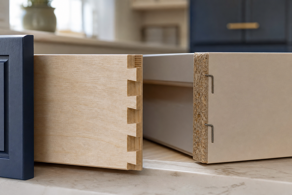
The most common two-tone mistake is ignoring undertones. Pair warm with warm and cool with cool, or the two colors will fight and the room will feel off even if you cannot say why. A warm creamy white clashes with a cool blue-gray; a crisp cool white sits perfectly with navy. Order sample doors and view them in your own kitchen at morning and evening light before you buy anything.
These are the factors that decide whether a two-tone scheme feels cohesive or chaotic.
Sheen matters too. Keeping both colors in the same sheen, satin or semi-gloss, reads more intentional than mixing a matte lower with a glossy upper. And the split works best when there is genuine value contrast; two mid-tones that are close in darkness can look like a mistake rather than a design choice. If you are still choosing door profiles, our cabinet door styles guide and complete shaker cabinet guide help you match the shape to the palette.
Countertops, Backsplash, and Hardware
The elements between your two cabinet colors are what tie the scheme together. A countertop that picks up both tones, a white quartz with a warm vein, for example, bridges white uppers and wood lowers effortlessly. The backsplash is the referee: a neutral tile calms a bold pairing, while a color-matched or contrasting tile can push the drama further. Hardware should usually stay consistent across both colors so the eye reads the cabinetry as one system; brass warms a cool palette, while matte black sharpens a warm one. Our cabinet hardware guide covers finish pairings in detail, and if you are repainting existing boxes rather than buying new, start with our guide to painting kitchen cabinets.
Contractor’s take
The mistake I see most is people picking two colors they love in isolation and never taping large samples to the actual cabinets. Undertones only reveal themselves at scale and in your own light. I make every client live with poster-size swatches on the uppers and lowers for at least two days before we order a single door. It saves thousands in do-overs.
What Two-Tone Cabinets Cost in 2026
Going two-tone with new cabinets rarely costs much more than a single color, most manufacturers charge little or nothing extra for a second finish, so the main variable is whether you buy new, reface, or repaint. Repainting existing cabinets is the budget path: expect about $30 to $70 per linear foot, or roughly $2,000 to $6,500 for a professionally painted average kitchen, with materials alone running $200 to $600 for a DIY job. Painting only the island or only the lowers cuts that figure sharply.
New two-tone cabinetry follows standard cabinet pricing, since the color split is mostly a finish choice rather than a construction one. Below are realistic 2026 ranges for the two-tone route.
| Approach | Typical 2026 cost | Notes |
|---|---|---|
| Repaint island only | $400 – $1,200 | Fastest, lowest-risk two-tone move |
| Repaint lowers or uppers | $1,200 – $3,500 | DIY materials $200 – $600 |
| Full repaint, two colors | $2,000 – $6,500 | Pro labor is 80% of cost |
| Reface with two finishes | $4,500 – $10,000 | New doors and veneer, keep boxes |
| New two-tone cabinets | $8,000 – $22,000+ | Little to no upcharge for second color |
Two-Tone in Small Kitchens
Two-tone is a genuine asset in a small kitchen when you follow one rule: keep the uppers light. Light wall cabinets and a darker base or island make a compact room feel taller and less boxed in, while an all-dark scheme can close it down. A single contrasting island or a run of colored lowers gives personality without shrinking the space. For layout constraints and budget-friendly moves in tight footprints, our small-kitchen resources pair well with the ideas here, and pulling color onto just the lowers is one of the most cost-effective updates in our white kitchen ideas playbook.
How to Make Two-Tone Feel High-End
The difference between a two-tone kitchen that looks custom and one that looks like a compromise usually comes down to restraint and repetition. Restraint means limiting yourself to two cabinet colors plus one metal finish, rather than layering in a third cabinet tone that muddies the plan. Repetition means echoing each color somewhere beyond the cabinets: the darker tone can reappear in bar stools, pendant shades, or window trim, while the lighter tone carries into the countertop and backsplash. That echo is what makes the scheme feel composed instead of accidental.
Continuity in the details also signals quality. Run the same countertop across both cabinet colors so the eye reads one uninterrupted work surface. Keep toe kicks and crown or trim consistent. And resist the urge to add a bold backsplash on top of a bold color split; when the cabinets are doing the talking, a quiet, high-quality tile lets them. These small alignment choices are what separate a designer kitchen from a DIY color experiment.
Two-Tone Mistakes to Avoid
Most disappointing two-tone kitchens trace back to a short list of avoidable errors. Run through these before you commit.
- Mixing warm and cool undertones so the two colors visibly clash
- Choosing two mid-tones with too little contrast to read as intentional
- Putting the dark color on the uppers in a small or low-ceilinged room
- Switching hardware finishes between the two colors and fragmenting the look
- Skipping large in-place samples viewed in morning and evening light
- Letting the backsplash fight both cabinet colors instead of bridging them
Your next move
You know the number. What are you deciding next?
Everything you need to plan a kitchen remodel in 2026 - budget, layout, cabinets, countertops, appliances, timeline, hiring,…
Continue →A kitchen remodel costs $18,000 to $120,000 in 2026, with a national average near $42,000. Here's the full…
Continue →Kitchen cabinets cost $80-$800 per linear foot installed in 2026. Here's what stock, semi-custom, and custom really cost,…
Continue →Frequently asked
Are two-tone kitchen cabinets still in style in 2026?
Yes. Two-tone cabinets are firmly on trend, with the palette leaning toward earthy neutrals, muted greens, navy, and wood-and-white pairings. The look reads as custom and is popular across both modern and traditional kitchens.
Which color goes on top and which on the bottom?
The reliable rule is darker or bolder on the lowers to ground the room and lighter on the uppers to keep it open. Reversing it can work in tall rooms but often looks top-heavy, so most designers avoid it.
Do two-tone cabinets cost more than one color?
Usually very little. Most cabinet makers charge no meaningful upcharge for a second finish. If you are painting existing cabinets, doing only the island or lowers is cheaper than a full two-color repaint.
What is the safest way to try two-tone?
Paint only the island a contrasting color while keeping the perimeter uniform. It delivers the two-tone effect, is easy to coordinate with countertops, and is simple to change later if you tire of it.
How do I keep the two colors from clashing?
Match undertones, warm with warm, cool with cool, keep both cabinet colors in the same sheen, and use hardware and a bridging backsplash to tie them together. Always test large samples in your own light first.

Cost ranges reflect 2026 US averages for cabinet painting, refacing, and new cabinetry.